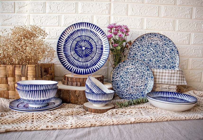
Blue and White Series Pad Stamping Dinnerware
From dinner plates to bowls, each item in the collection is designed to elevate your dining experience, adding a touch of sophistication and refinement to any table setting. Whether you are hosting a formal dinner party or enjoying a cozy meal at home, our Blue and White Series Pad Stamping Dinnerware effortlessly complements any occasion with its understated yet captivating aesthetic.
.section-block-demo41-about2 { position: relative; padding: 2rem 0; } .section-block-demo41-about2 [heading-type="1"] { padding: 0; } .section-block-demo41-about2 .title-bar { padding: 1rem; text-align: center; } .section-block-demo41-about2 .title-bar .title { font-size: 2.5rem; line-height: 1; } .section-block-demo41-about2 .title-bar .text { font-size: 16px; color: #4f4f4f; margin-top: 1rem; } .section-block-demo41-about2 .about-items { margin-top: 3.5rem; padding: 1rem; } .section-block-demo41-about2 .about-item { position: relative; padding: 1rem; } .section-block-demo41-about2 .about-item:nth-child(even) .item-inner { flex-direction: row-reverse; } .section-block-demo41-about2 .item-inner { display: flex; flex-wrap: wrap; color: var(–bs-body-color); } .section-block-demo41-about2 .item-inner .item-img { position: relative; width: 50%; z-index: 1; } .section-block-demo41-about2 .item-inner .item-img .item-bg { width: 91%; height: 91%; position: absolute; top: -1.8rem; z-index: -1; } .section-block-demo41-about2 .about-item:nth-child(odd) .item-img .item-bg { left: -1.8rem; background-color: #f0f0f0; } .section-block-demo41-about2 .about-item:nth-child(even) .item-img .item-bg { right: -1.8rem; background-color: #c3c7d0; } .section-block-demo41-about2 .item-inner .item-img img { width: 100%; } .section-block-demo41-about2 .item-inner .item-info { width: 50%; padding: 2rem 5rem; margin: 1.8rem 0; display: flex; flex-direction: column; align-items: center; justify-content: center; align-items: flex-end; text-align: right; } .section-block-demo41-about2 .about-item:nth-child(odd) .item-info { background-color: #f0f0f0; } .section-block-demo41-about2 .about-item:nth-child(even) .item-info { background-color: #c3c7d0; } .section-block-demo41-about2 .item-info .item-title { font-size: 1.7rem; } .section-block-demo41-about2 .item-info .item-subTitle { font-size: 1.14rem; margin: 1rem 0; } .section-block-demo41-about2 .item-info .item-subTitle i { width: 4rem; height: 1px; background-color: currentColor; display: inline-block; vertical-align: middle; margin-right: .5rem; } .section-block-demo41-about2 .item-info .item-desc { color: #4f4f4f; font-size: 12px; line-height: 2; } @media only screen and (max-width:1280px) {} @media only screen and (max-width:992px) { .section-block-demo41-about2 .title-bar .title { font-size: 2rem; } .section-block-demo41-about2 .about-item { padding: 0; margin-bottom: 1rem; } .section-block-demo41-about2 .item-info .item-title { font-size: 1.5rem; } .section-block-demo41-about2 .item-inner .item-info { padding: 2rem; } .section-block-demo41-about2 .item-inner .item-img .item-bg { top: -1rem; } .section-block-demo41-about2 .about-item:nth-child(odd) .item-img .item-bg { left: -1rem; } .section-block-demo41-about2 .about-item:nth-child(even) .item-img .item-bg { right: -1rem; } } @media only screen and (max-width:640px) { .section-block-demo41-about2 .item-inner .item-info { padding: 1.5rem; } .section-block-demo41-about2 .item-inner .item-img, .section-block-demo41-about2 .item-inner .item-info { width: 100%; margin: 1rem 0; } .section-block-demo41-about2 .about-items { margin-top: 2rem; padding: 0; } } @media only screen and (max-width:576px) { .section-block-demo41-about2 .title-bar .title { font-size: 1.6rem; } .section-block-demo41-about2 .item-info .item-title { font-size: 1.2rem; } } #sectionId1kngvlh > .layout.about-items > .about-item > .item-inner > .item-info > h1 {text-align: left;}#sectionId1kngvlh > .layout.about-items > .about-item > .item-inner > .item-info {text-align: left;}#sectionId1kngvlh > .layout.about-items > .about-item > .item-inner > .item-info > h3 {text-align: left;width: 100%;}
Professional technical engineer dedicated to guide you
According to your actual needs, choose the most reasonable overall design and planning procedures